Nu Skin | Lumispa
Advancing the mission of Nu Skin’s global brand through design-driven product innovation and connected digital experiences.
How a global enterprise rediscovered its truest identity by focusing on what made it successful in the first place: human-centered product innovation.

Nu Skin ageLOC Lumispa integrated product experience
Client overview:
Nu Skin Enterprises is an international beauty, cosmetics, and wellness company specializing in personal care and dietary supplements. Nu Skin was founded in 1984 on a multi-level marketing platform designed to promote what is now a global network of more than 1.2 million distributors worldwide. While Nu Skin is no stranger to competition in a densely crowded marketplace, its continued commitment to people, products, and innovation has shaped it into a multi-billion-dollar industry powerhouse.
Business rationale:
By 2016, the rise of online marketing and e-commerce tools, paired with readily available products off the shelf from Chinese manufacturers, was beginning to make a dent in Nu Skin’s global distribution model. Many more product distributors entered a transactional space by white-labeling inferior products and selling them at a discounted rate, with infamous results for the end consumer. At the same time, consumer demand was beginning to want and expect more personalized products and care. With the rise of digital transformation, consumers needed solutions they could invest in and trust. Specifically, in skincare, consumers looked for personal devices that integrated with their mobile technology. Feeling confident, beautiful, and connected drove consumer needs and paved the way for an entirely new, never-before-seen skincare product.
Primary business objective: Return Nu Skin to its roots as an industry leader by pioneering the next evolution of skincare through personal devices and integrated digital products.
Claiming table stakes won’t differentiate Nu Skin from global or regional competitors.
Creating a unique, authentic product that adds value to people’s lives will differentiate.
Branding the product with its own visual identity can go a long way toward facilitating differentiation and supporting positive perceptions.
Designing global growth strategy
As more companies accept the business value of visionary design, design thinking becomes increasingly critical in shaping a sustainable growth strategy. Business-design strategists need to have the head of an analyst, the heart of a designer, and the ability to understand and communicate across the entire customer lifecycle if they hope to drive true innovation. It includes everything from market research, consumer insights, channel strategy, content marketing, technical architecture, engineering, and development (yes, that means occasionally rolling up your sleeves and coding).
Our job as designers is to take big, juicy, complicated problems and turn them into human-centered ideas for innovation and growth that can succeed in the real world. We use logic, analysis, and financial modeling and our intimate understanding of content and communications to help organizations turn their biggest, wildest ideas into products with long-term viability.
“Breakthrough products require breakthrough design strategies.”
—
Paula Scher
Partner, Pentagram
Solution vision: Characterizing the right solution in human terms
Engaging: Products need to add authentic, personalized value to the customer experience to promote the right partnership level between Nu Skin’s brand and its consumers.
Integrated: Personal devices need to connect to mobile and digital technology and facilitate connected experiences across devices. People don’t simply want a skincare solution; they want their skincare solution.
Unique: Products need to be differentiated in ways that add actual value to the customer experience and in that the competition can’t replicate.
Sustainable: With any global enterprise, there are both resources and responsibility. The right products must not harm people or the planet.
Scientific: Nu Skin employs a large team of product scientists with a responsible practice for testing and validating solutions with real customers.
Solution summary:
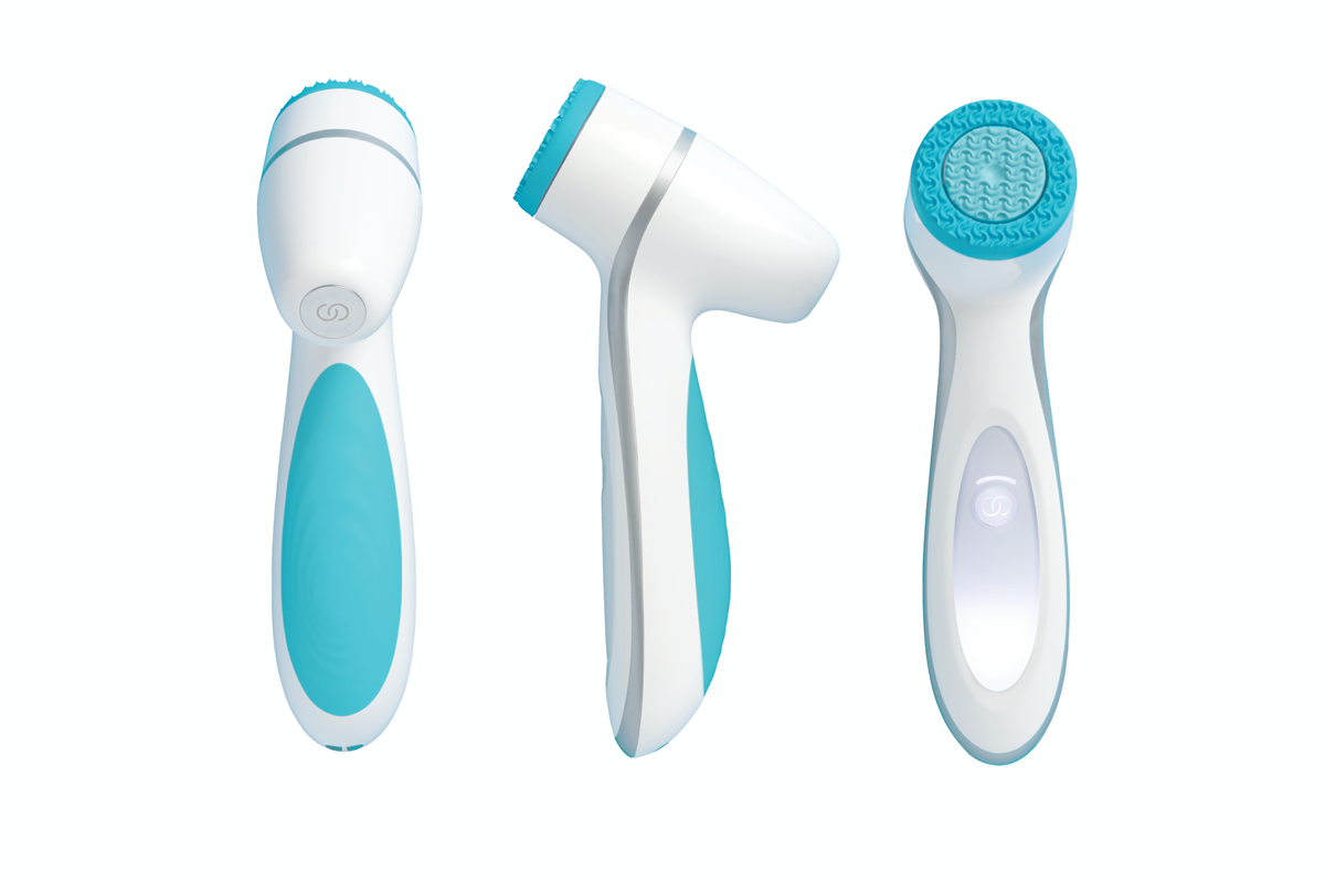
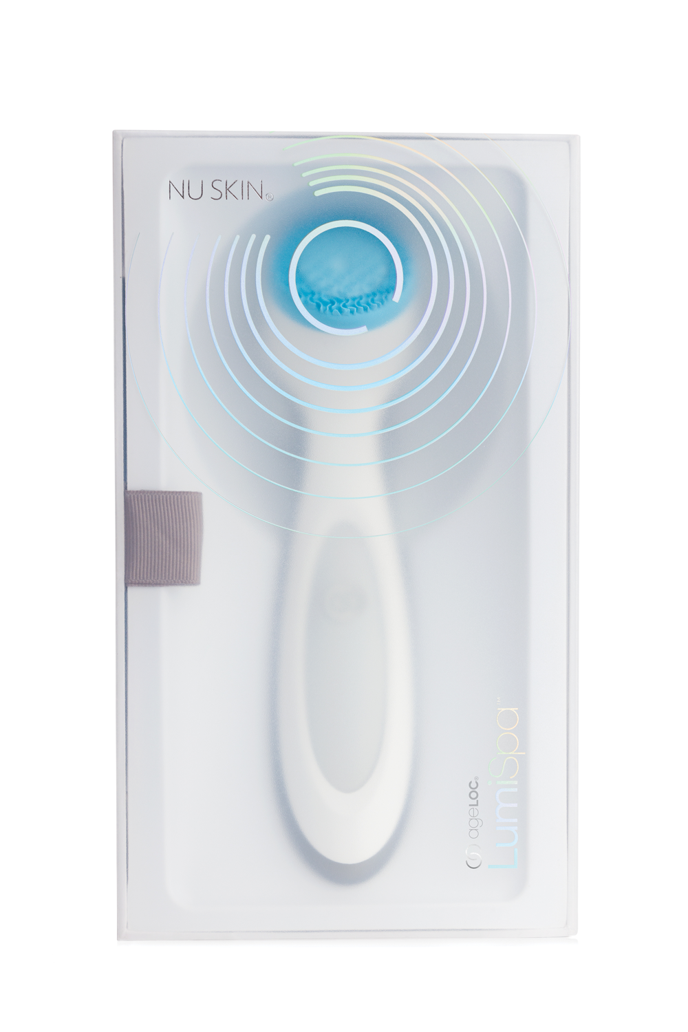
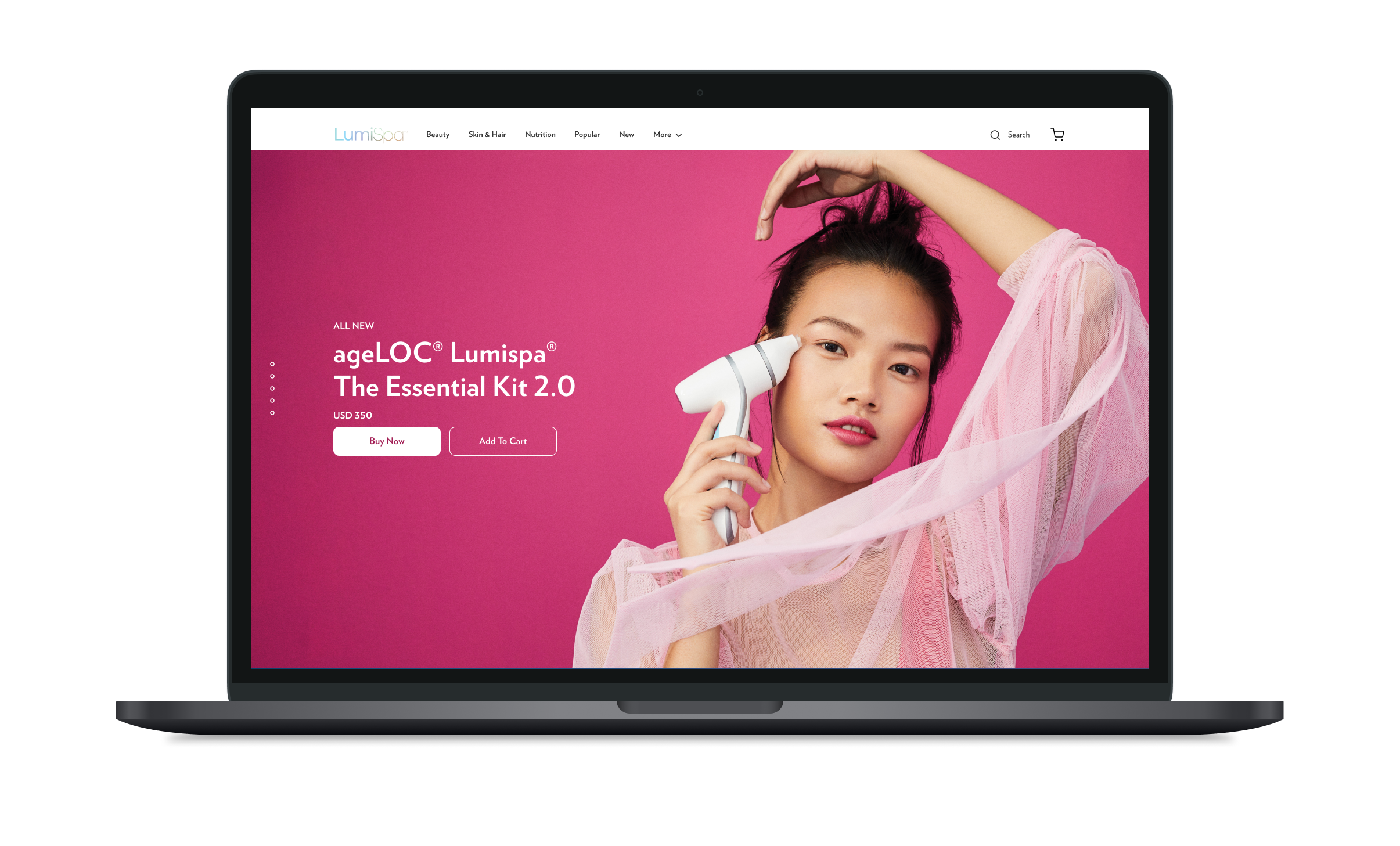
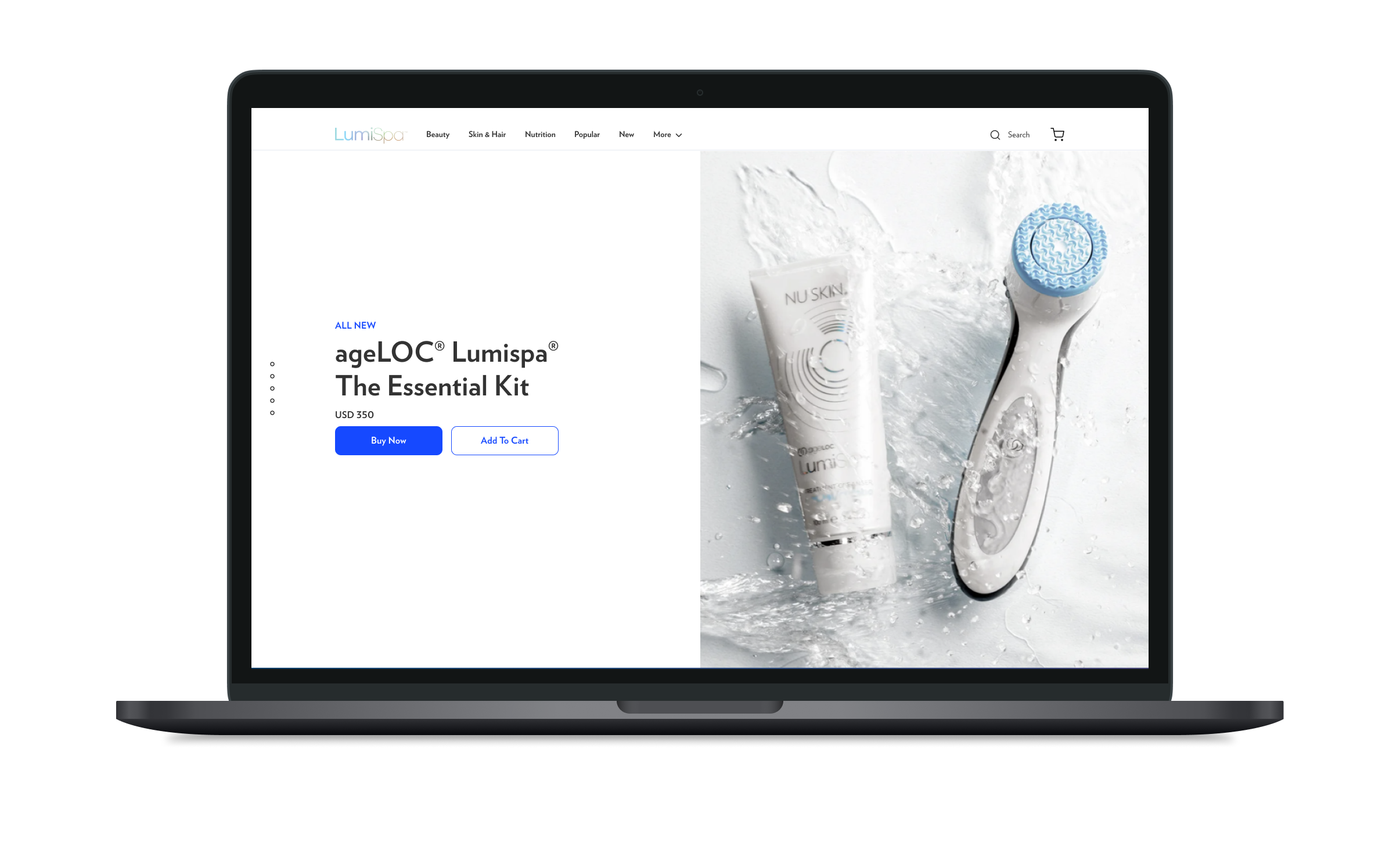
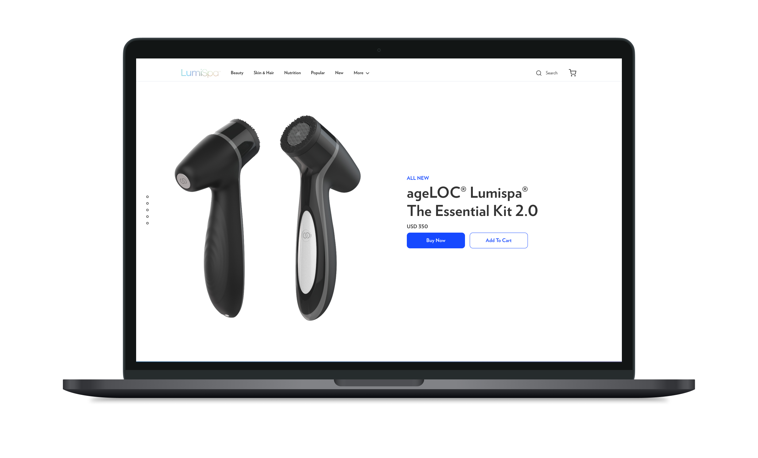
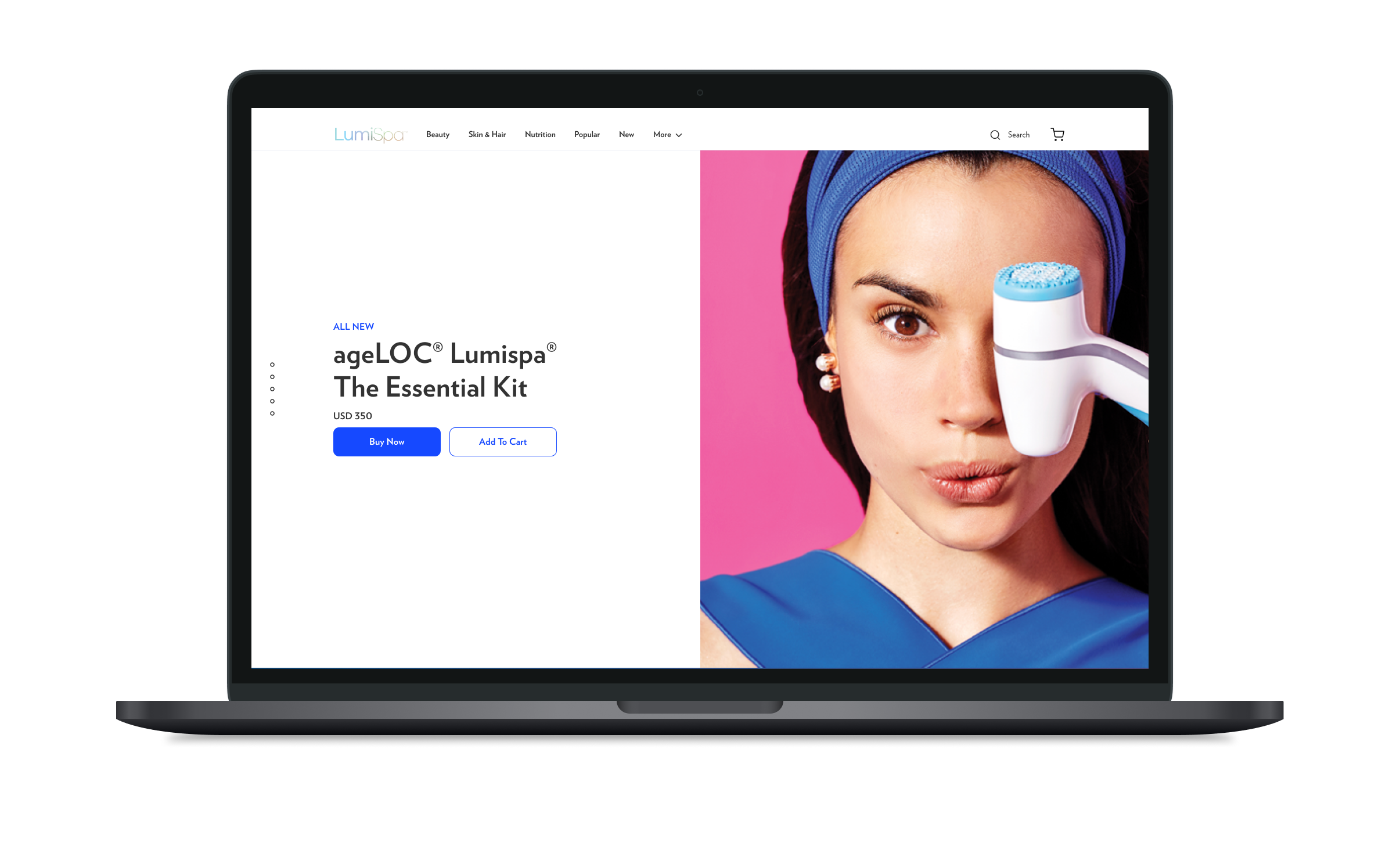
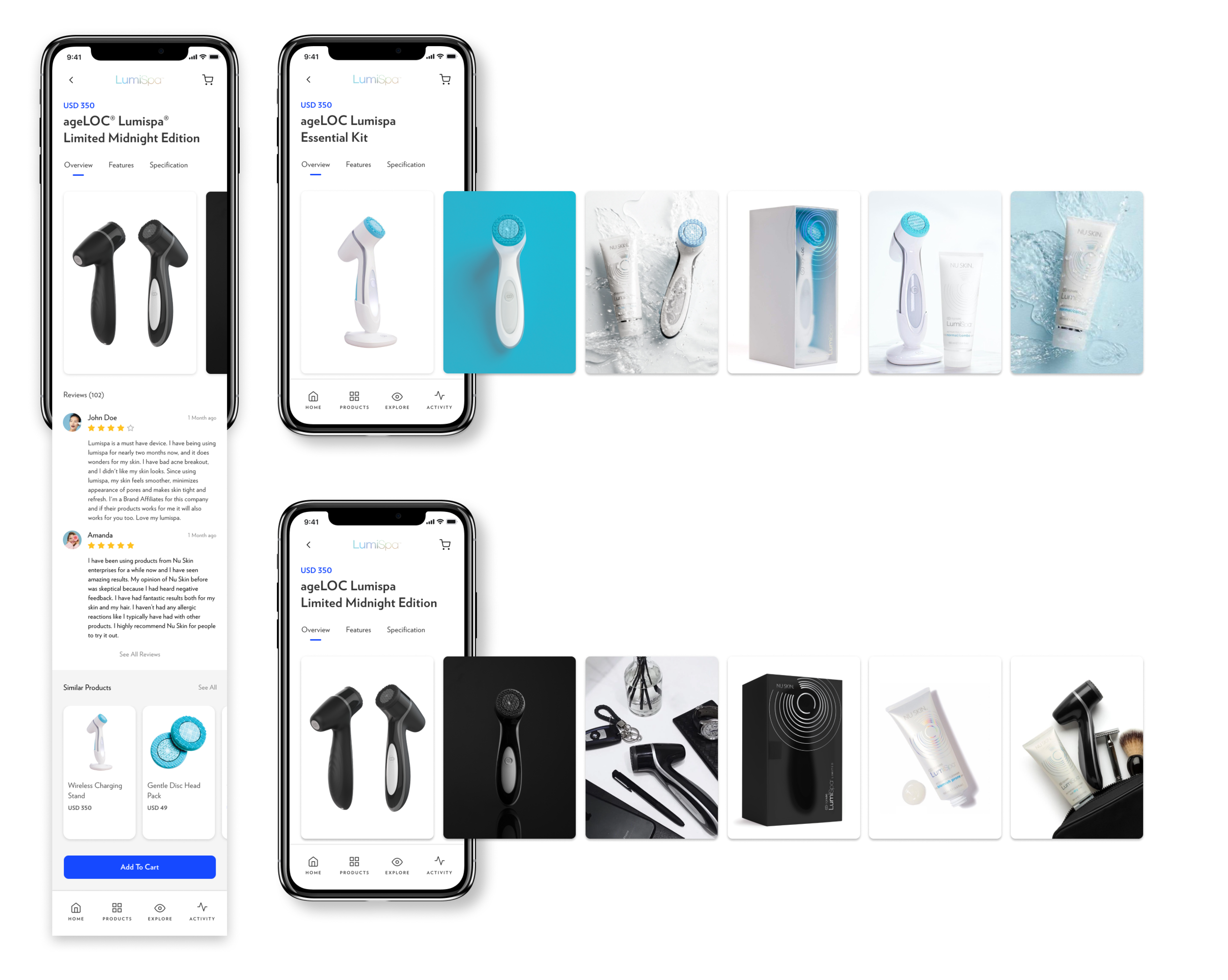
Device: Handheld personal skincare device designed to enable personalized care through the daily routine.
Brand: ageLOC Lumispa adequately expresses product identity without losing sight of Nu Skin’s global brand presence.
Assets: Product logos, marks, icons, typography, and imagery were developed into packaged style sheets designers could apply globally via Nu Skin’s new digital asset management (DAM) platform.
Content: Nu Skin becomes the trusted guide for global skincare through a unique product story (localized across markets) that guides consumers through enhancing their beauty and wellness through personal skincare routines.
Technology: Web and mobile product sales are table stakes, but connected experiences between personal device hardware and software represent a genuinely new and innovative approach to personalized skincare. This approach leads to the development of richer experiences and better results for both Nu Skin and its customers.
Design Systems: A consistent design system language (DLS) is essential for Nu Skin to leverage the full power of integrated solutions across channels, communications, and technology.
Designing 360-degree skincare solutions

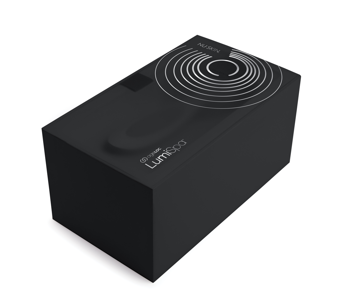
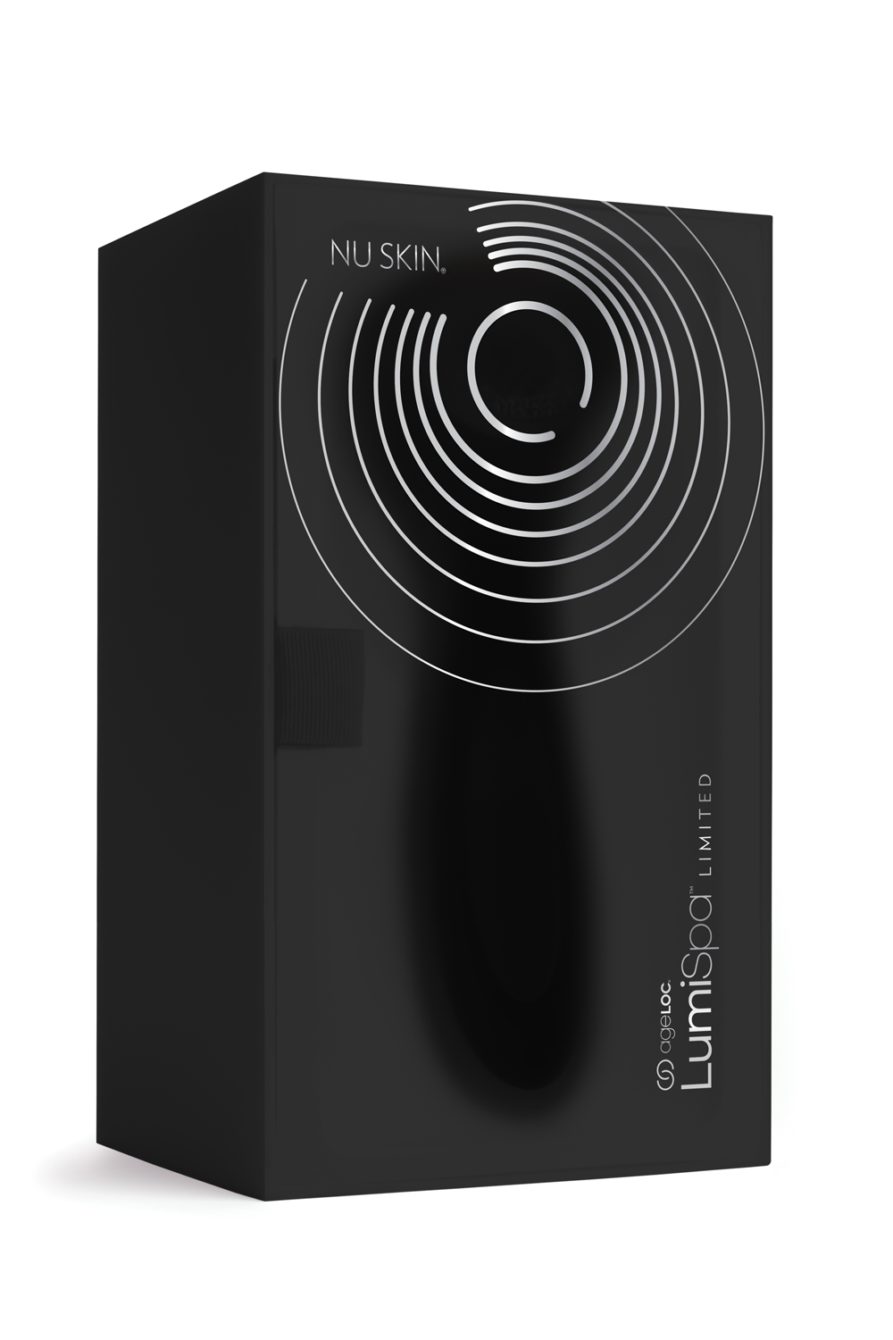
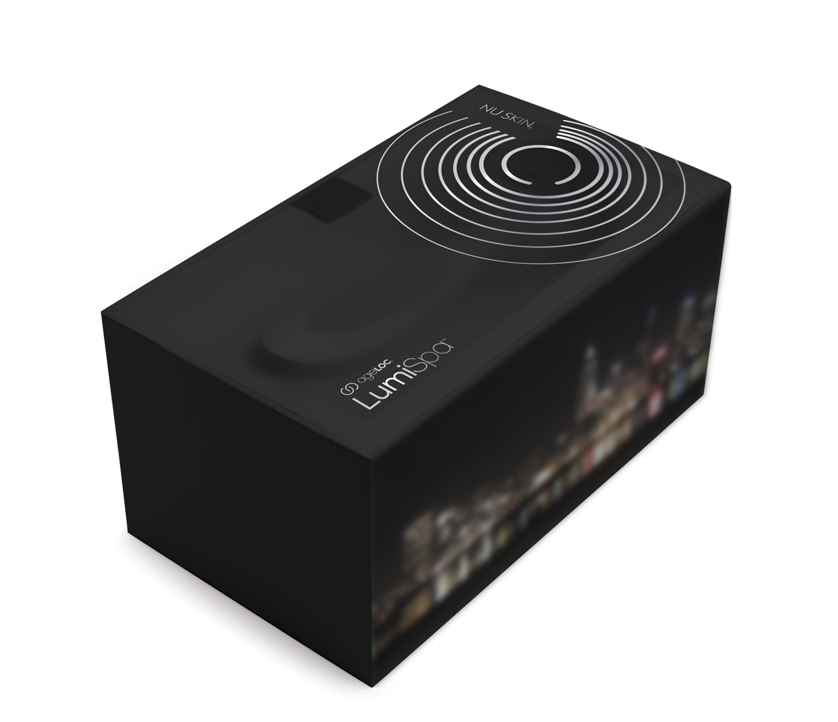
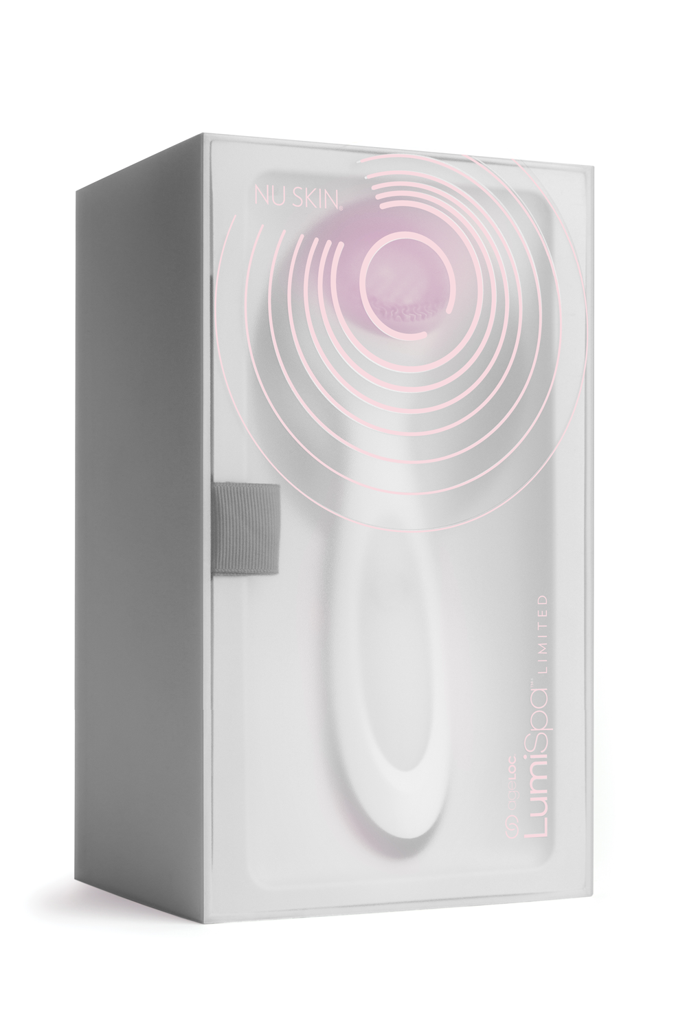
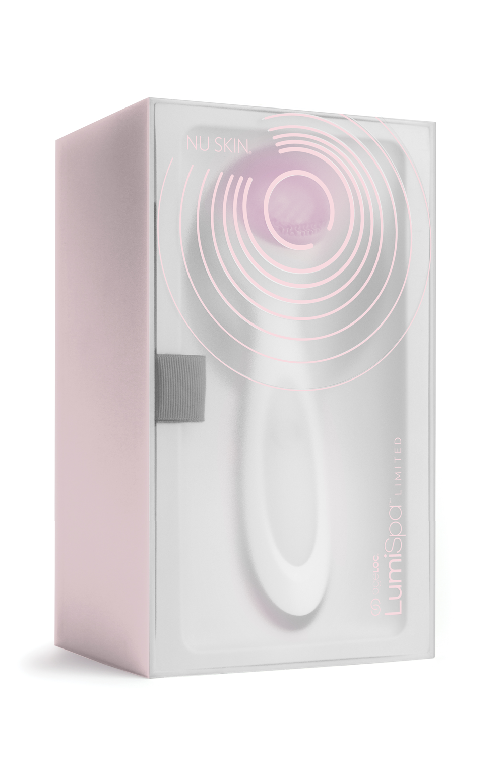
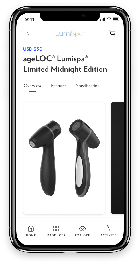
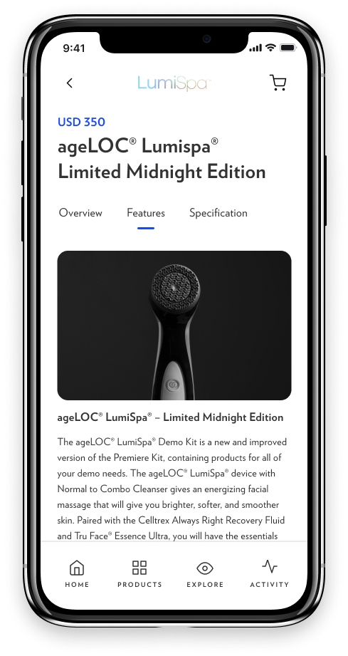
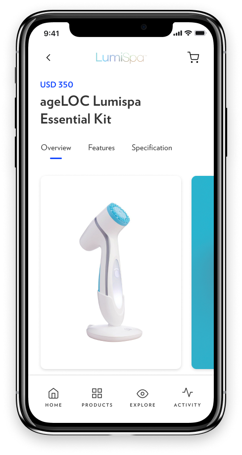
Product variations: Driving strategic exclusivity through limited edition devices and colorways.


Designing product brand identity
People everywhere are looking for products that can solve problems, meet their needs, and connect with their values. As consumers have seemingly infinite choices, it’s essential that every expression of a product’s identity be memorable, identifiable, and centered on the customer.
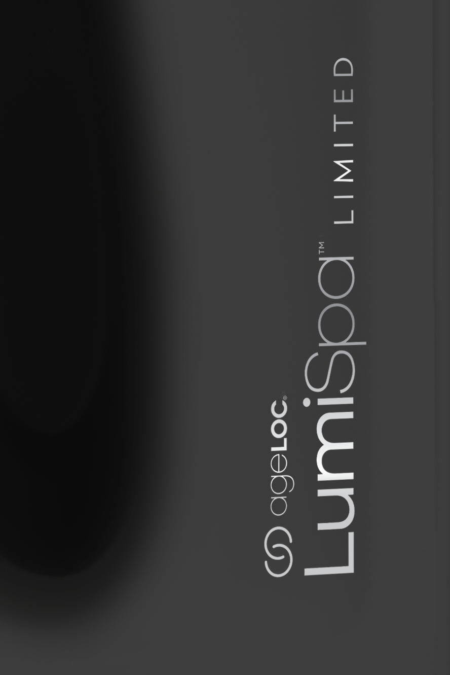
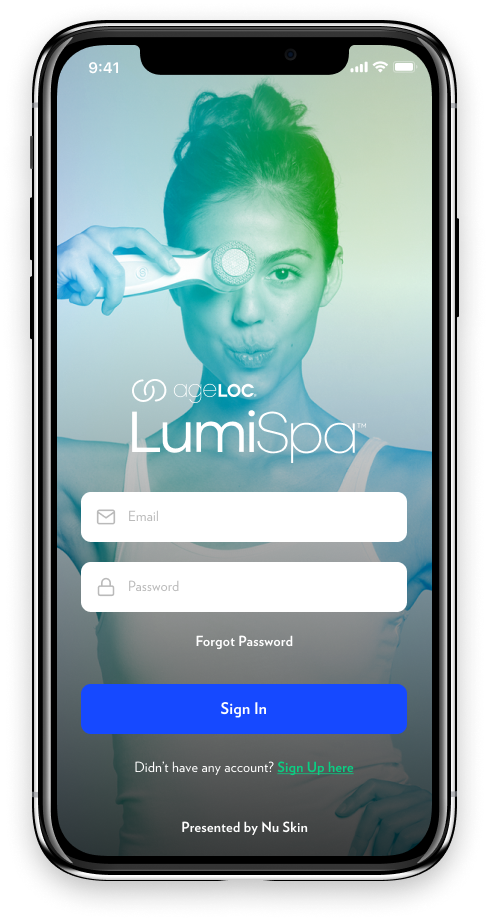
Naming: ageLOC Lumispa
The best brand name is timeless, tireless, and easy to say and remember. It facilitates positive perception and recognition across channels, communication touchpoints, and cultures. A well-chosen name is an essential component of excellent product identity programs and a 24/7 workhorse.
Lumispa comes from 2 root words, ‘Lumi,’ which is short for luminosity, and ‘Spa.’ Our name design expresses the brilliant cleansing power of the Lumispa device and inspires a sense of exclusivity without arrogance. The name is friendly, short, and memorable. Moreover, its unique structure facilitates brand extensions by building off a previously established ageLOC brand and setting itself apart from a densely crowded consumer marketplace.

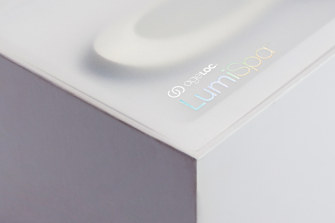
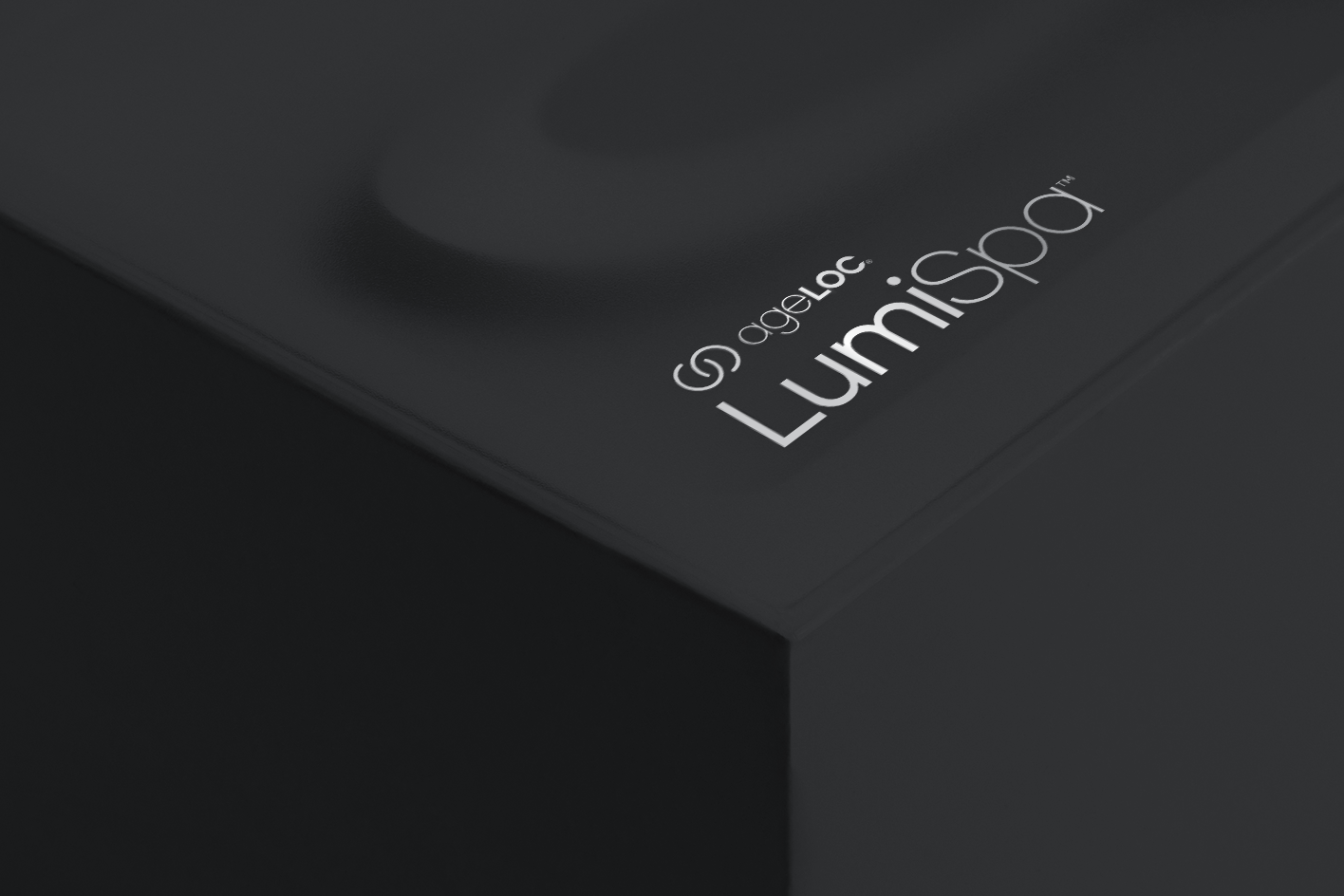
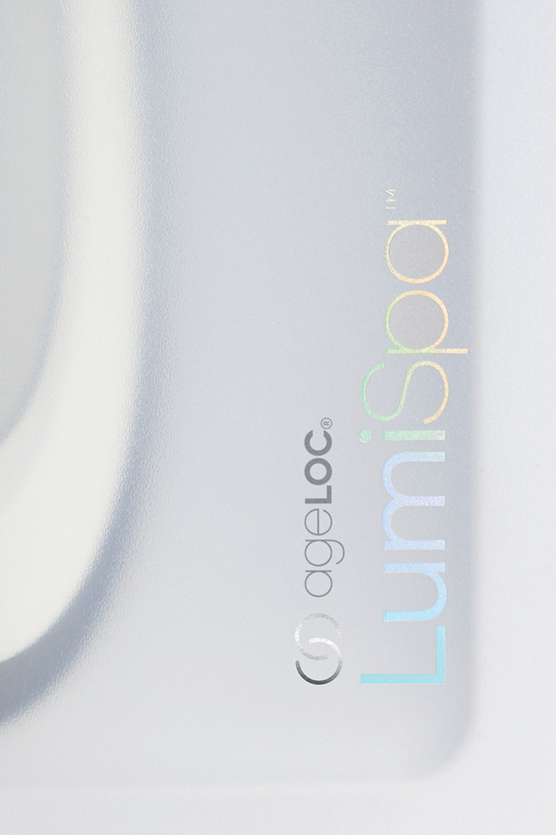
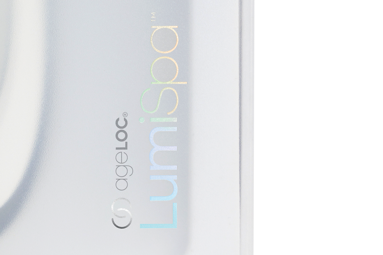
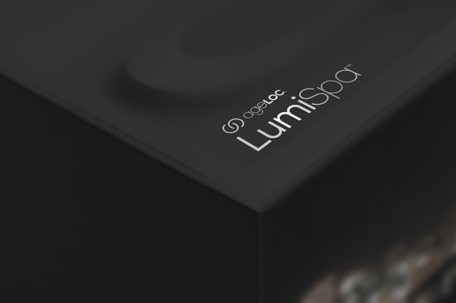
Logo design
Brand perception and awareness facilitate a robust visual identity. The Lumispa logo is the heart and soul of the product’s originality. It’s on every customer touchpoint and communication piece we create, so designing a logo we can use consistently and correctly is imperative. For viewers to recognize and identify our logo, it must be readable, legible, and accessible.


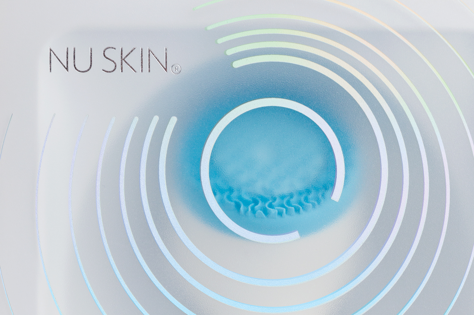
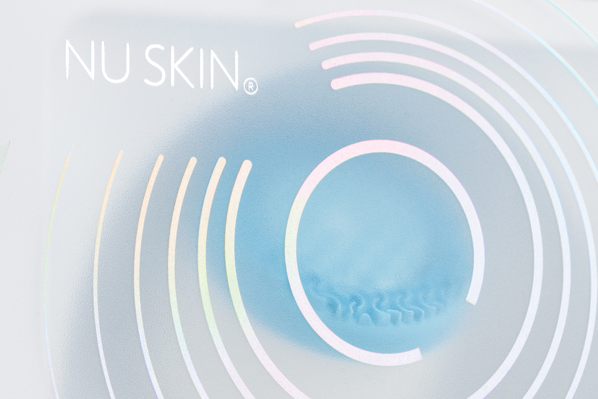
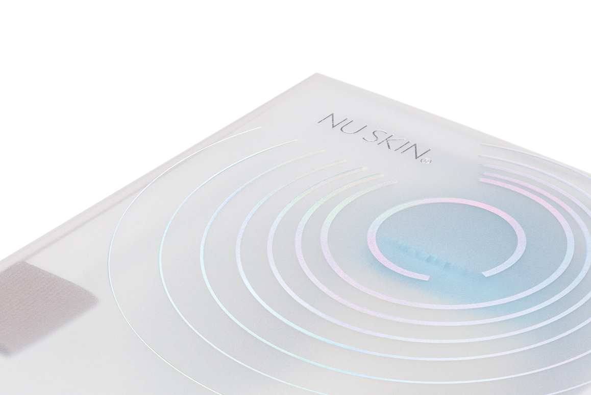
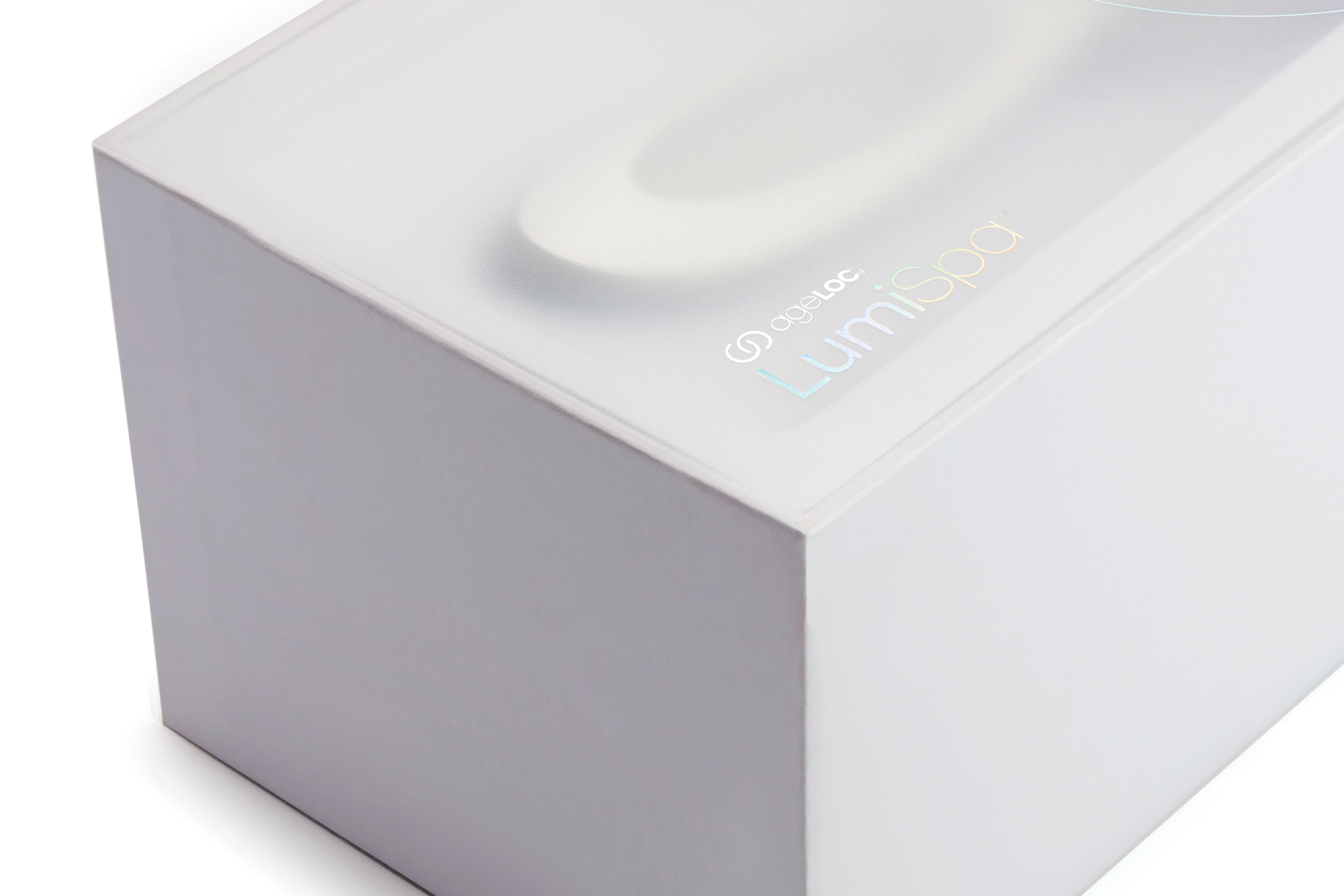
ageLOC Lumispa Rings
The logotype is clear and readable and is capable of proportional scaling at every touchpoint. The rings build off the ageLOC core product line branding but carry a unique pattern and colorway inspired by the vibrating, cleansing power of the device itself. The logo uses holographic foil when possible, but the following use cases are accounted for as well: Gradient 4C (Print); Gradient RGB (Digital Advertising); Gradient HEX / CSS (Web / Mobile).
Typography
The Verlag NU family is designed specifically for use by Nu Skin Enterprises. It’s available in various languages and formats for print, digital, web, and mobile applications. Easy to read in both headline and body, Verlag NU equips designers globally with a wide variety of choices that accommodate nearly every typographic need.

Color
We strategically use a hierarchy of colors to enhance the visual user experience across devices and platforms. The primary blue and gray color palettes are a simple extension of the Nu Skin global brand. In contrast, the extended colors and foils set the Lumispa device apart in a responsibly expressive way.

Imagery
The right visuals express product identity across both aspirational and practical content communications. Our imagery needs range from product-focus, beauty-lifestyle, and iconography.
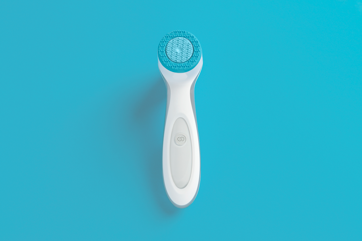
Product imagery
Our product imagery is a primary visual component in nearly every communication piece we create. The product must be accurate and consistent based on user preferences to allow consumer recognition and facilitate positive perceptions.


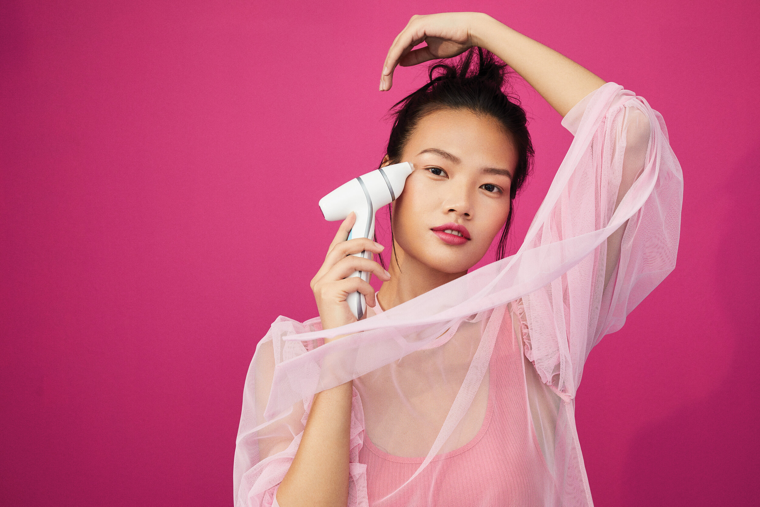
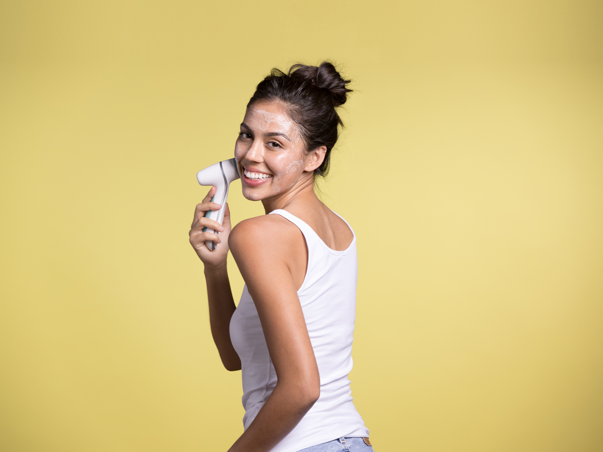
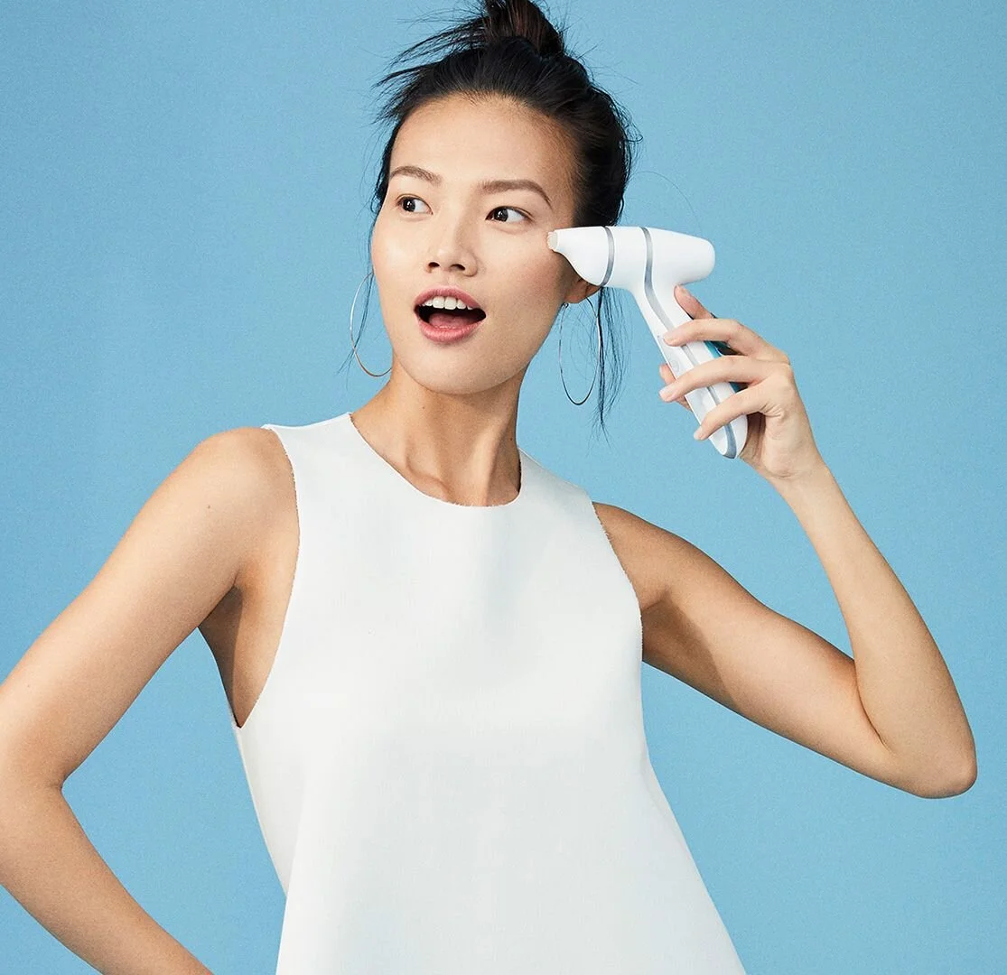
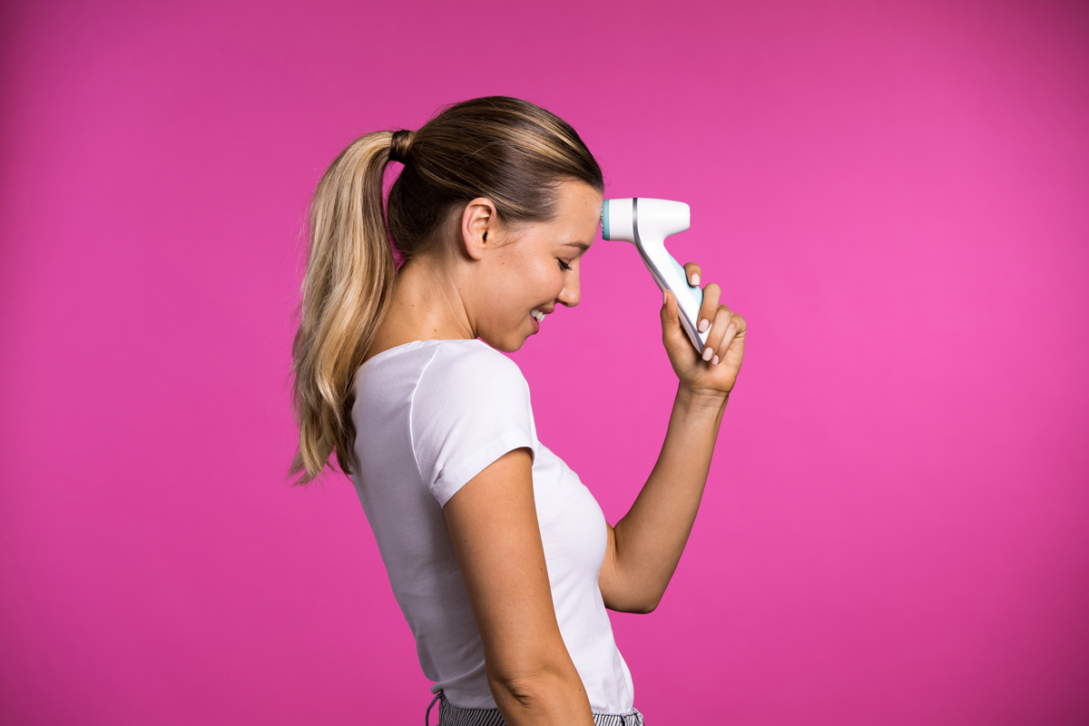
Beauty-lifestyle
People inspire and move us. They are the heroes of every story we tell about our product. They are aspirational and playful. They represent an ideal image of what we hope our device will inspire in ourselves and others.


Iconography
Primarily used to serve functional, navigational purposes, iconography can be a powerful tool. Our product icon library matches the expression of the rest of the product identity while also being clear, direct, and universally recognizable.

Putting it all together
Now that we have the right building blocks to assemble touchpoints, the focus becomes experimentation, execution, and optimization. Regardless of the application, the principles are always the same. Every touchpoint creates an experiential response for a user from beginning to end. While the global design team rolled out packaging, digital advertising, web, and mobile application designs, we also compiled a comprehensive identity system for regional markets to facilitate their localized product rollouts.
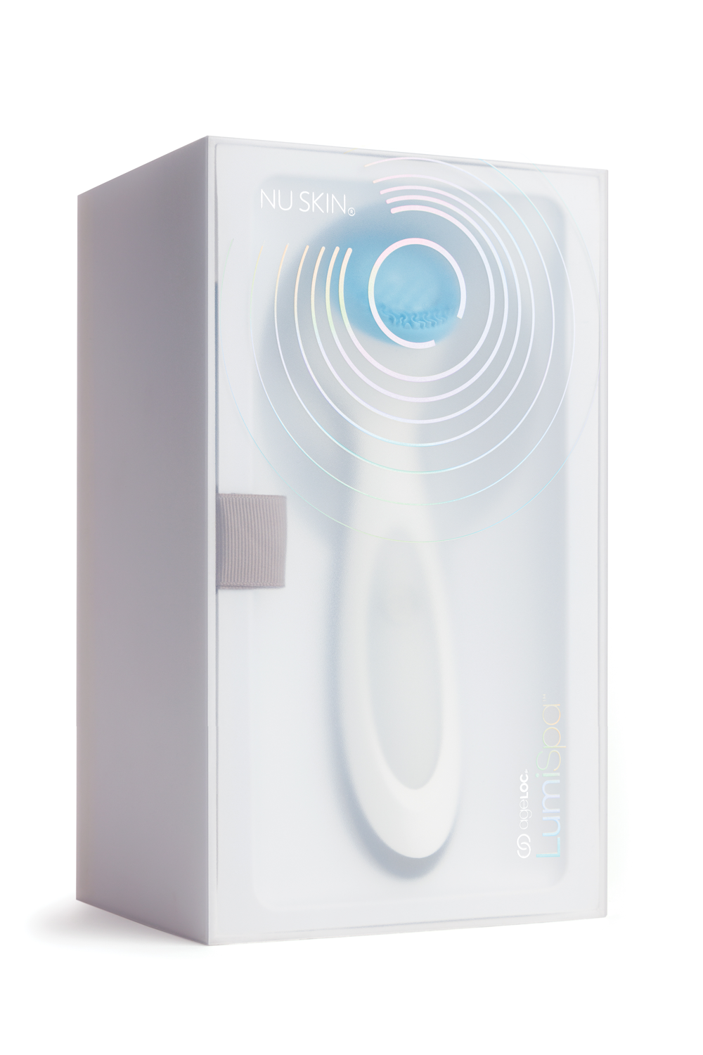
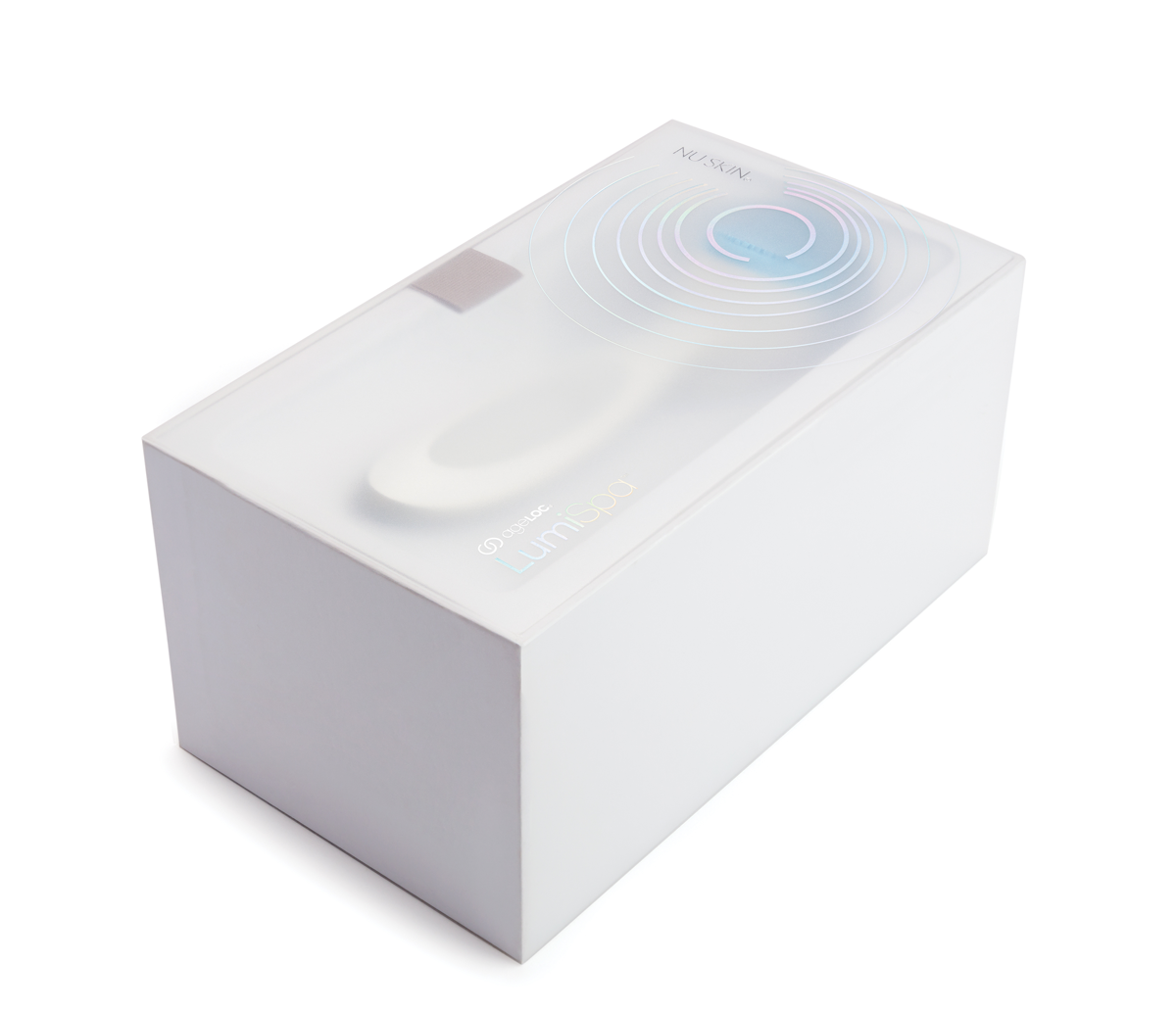
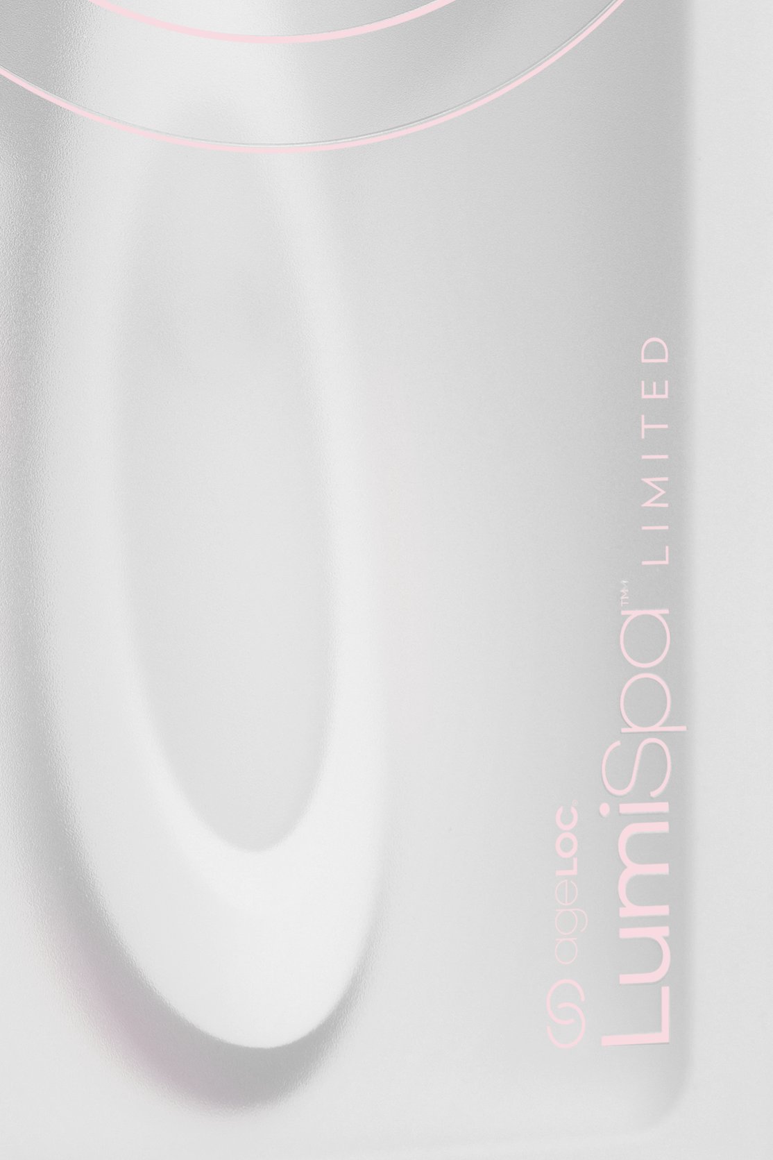
Product Packaging
The shelf is perhaps the most competitive marketing environment today, both physically and digitally. As products and brands experience nearly endless competition, the need to stand out and connect with the right people is imperative.


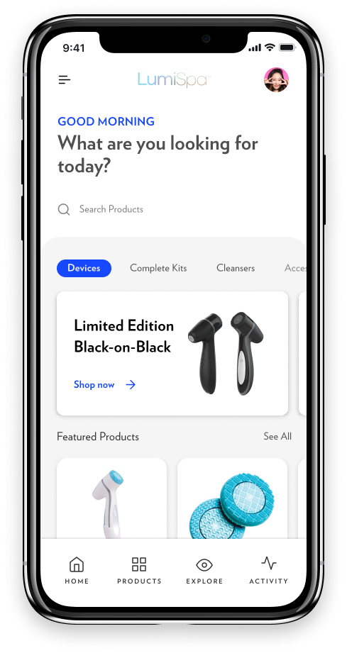
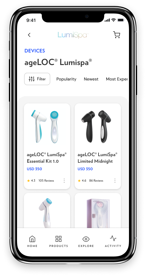
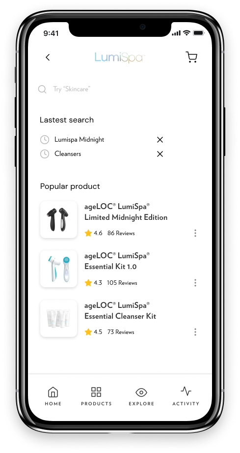
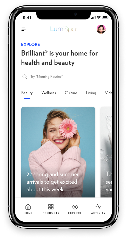
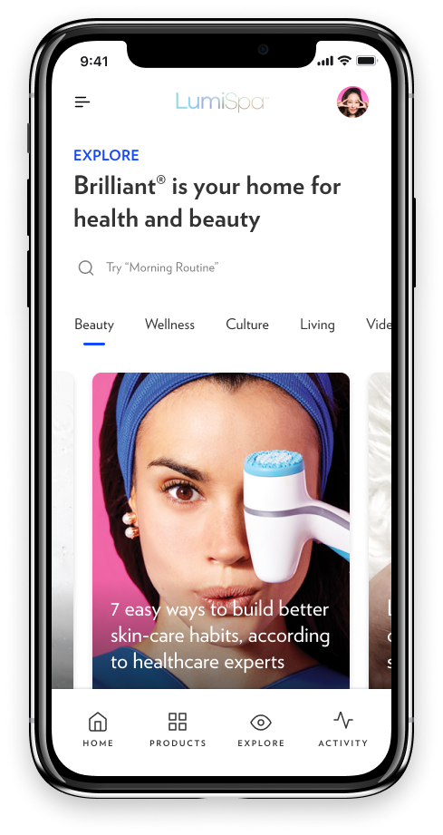
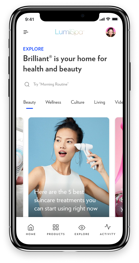
Digital products: Adapting atomic design systems for web and mobile applications
Web app navigation
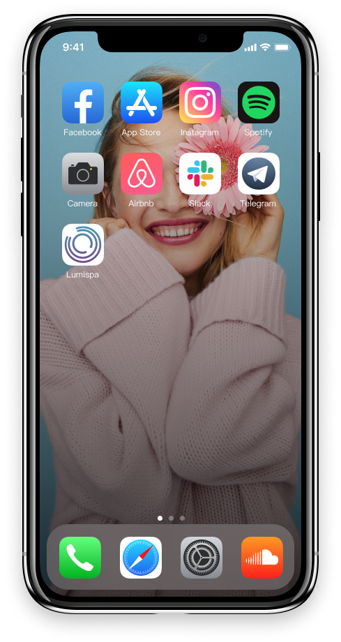
Mobile app icon
Atomic component library
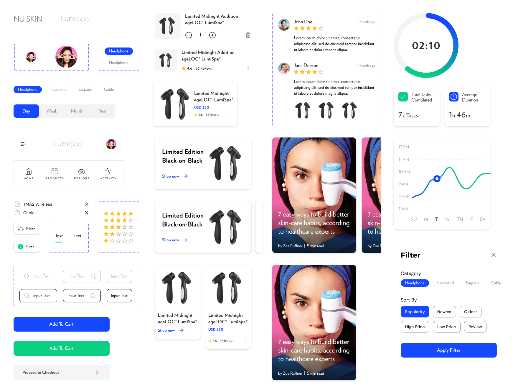


Web applications


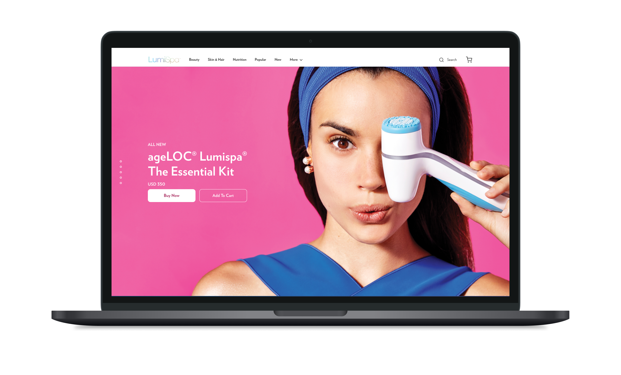
Mobile applications

Atomic Design Building Blocks


Connecting everything


Results summary
Go-to-market launch achieved successful penetration in 4/6 regions within year 1.
Identity elements exceeded target digital response rates by more than 15% globally.
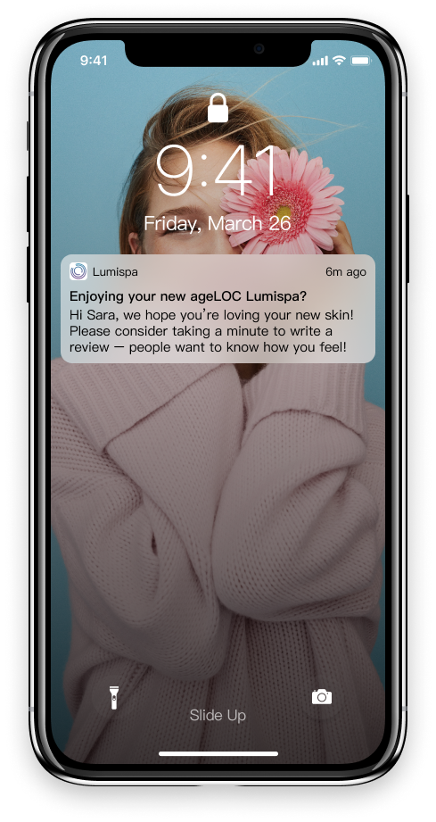
Mobile app usage went from virtually non-existent to ~17k daily active users within year 1.
More case studies


